Planning for the Final Task: Title Design
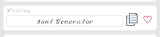
The opening credits of our film will be in a cursive font. The name of the font is Writing. This font will be used for the whole opening credits. The titles will fade into the screen, then it will fade away. It will be on the screen for about 5 seconds before fading away. Since its only a few words, I believe that's a good enough time to read. This is how the titles will appear on the screen throughout the opening credits: “𝒯𝒽𝓇𝑜𝓊𝑔𝒽 𝓉𝒽𝑒 𝒮𝓉𝓇𝓊𝑔𝑔𝓁𝑒”
The titles will be displayed onto the screen in purple and white with a Script MT font. I chose cursive and purple because purple is known for a majestic vibe. My film circulates around the royalty of all black women in the world and how they should be seen as queens and nothing less.
If needed, back up fonts will be “Monospace”. Here’s how it looks.

For the font size, we decided that we didn’t want to make the font size too big or too small. So we chose the font size 20-24. We don't want the words to look like they are crowded in the screen. It would look messy if I make the words to big. I also wouldn't want to make the words to small. I want the audience to be able to read what's on the screen.
The title of our film will be 'Through the Struggle'. Since it revolves around the topic of the struggles of black women in the world, I decided to name it as a way to describe the main character who is a black women struggling to be treated with respect and be ︎︎seen as more than what society perceives women to be.

Comments
Post a Comment